The Dashboard
Introduction
The feedback you gather from different Touchpoints is presented in the OMBEA Insights dashboard. You can access the dashboard with your username and password at https://insights.ombea.com/.
What you see in the dashboard depends on the type of Stream you are looking at. There are 4 main kinds:
Satisfaction Stream
Letter Stream
ActionPad stream
Link or Website Widget Stream
Smiley Stream Dashboard
We’ll start by taking a look at the Satisfaction Stream. In this case there are 4 panels as you can see in the diagram below:
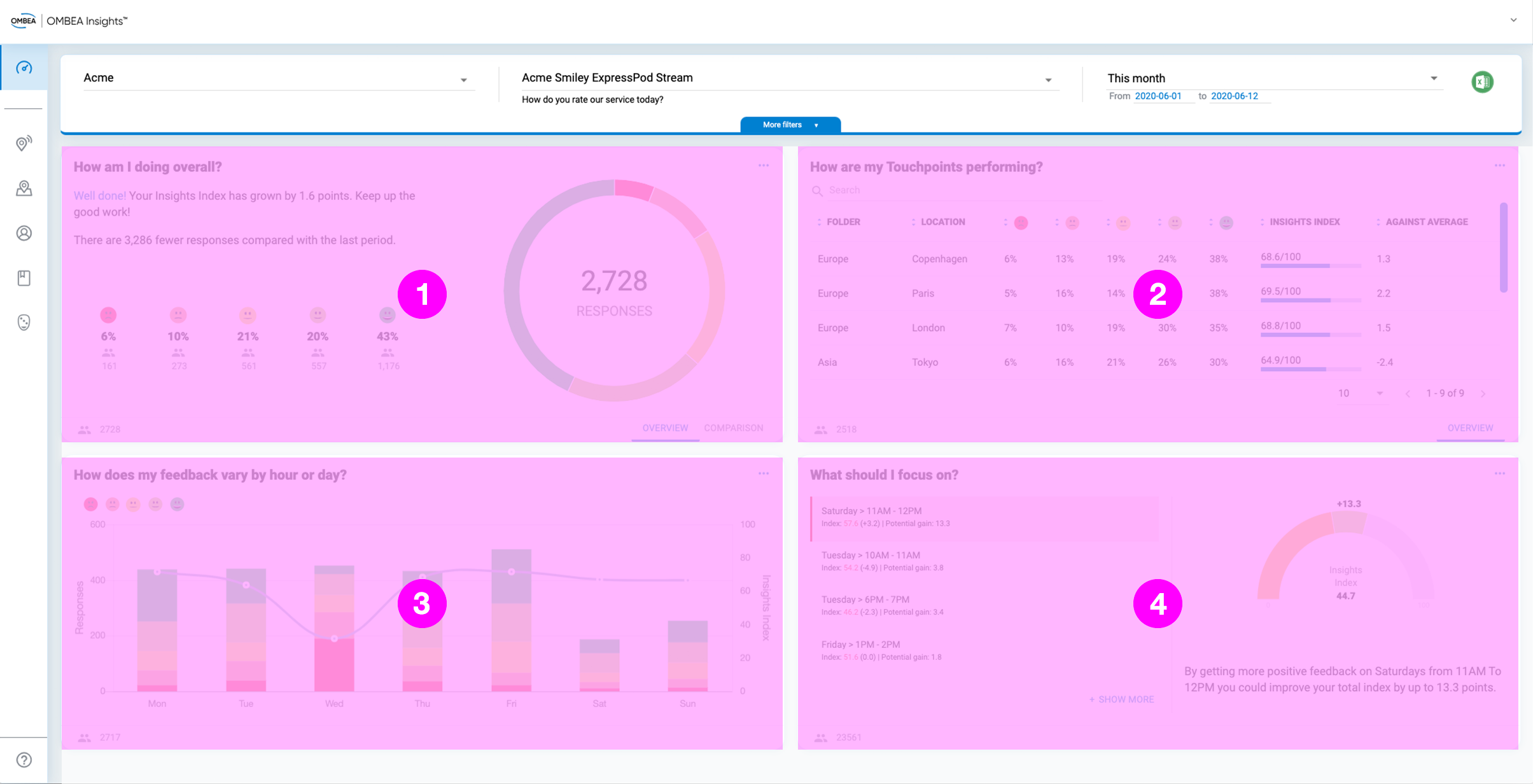
The panels shown are:
How am I doing overall? An overview of the results.
How are my Touchpoints performing? A summary of the different Touchpoints that contribute to the stream.
How does my feedback vary by hour or day? A closer look at the breakdown of results by time.
What should I focus on? These pointers show you problem areas you can address to improve satisfaction.
Pay close attention to the fourth panel - it will change as your feedback comes in and it’s the key to unlocking satisfaction improvements!
Filtering and Navigating the Dashboard
Around the dashboard you will find controls that let you filter the data or perform other key functions. The main ones are highlighted in the screenshot below:
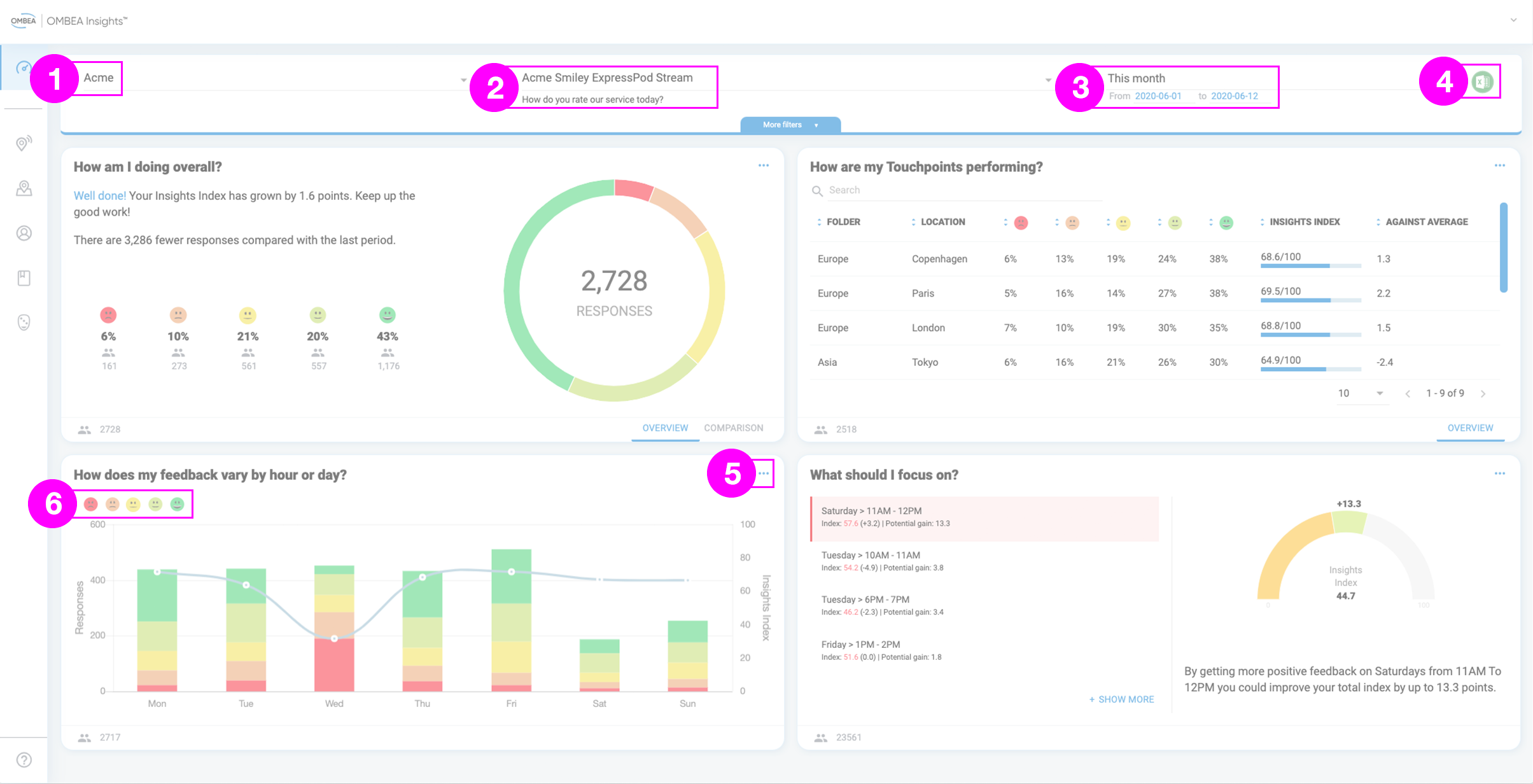
Taking each label in turn:
Choose a specific Touchpoint or Folder
Choose a specific Stream
Filter the date range. If you click the More Filters button you can select specific days and times within your date range.
Download your results as a Microsoft Excel spreadsheet.
Access further chart controls, such as the ability to view the chart in full screen.
Show and hide specific voting categories.
Where you have multiple Feedback Points, you can use Folders to view specific groups of them more easily. See our article on Working with Multiple Touchpoints to learn more.
Dashboard Layouts for Alternative Stream Types
So far, we’ve looked at the dashboard when viewing a Satisfaction Stream. Although it works in the same way, what you see changes when you have alternative stream types. Below is screenshot and brief explanation of each.
Letter Streams
This dashboard is for ExpressPods being used for multiple-choice question feedback. In this case, the main difference is that the What should I focus on? panel is missing because it’s not relevant to this scenario.
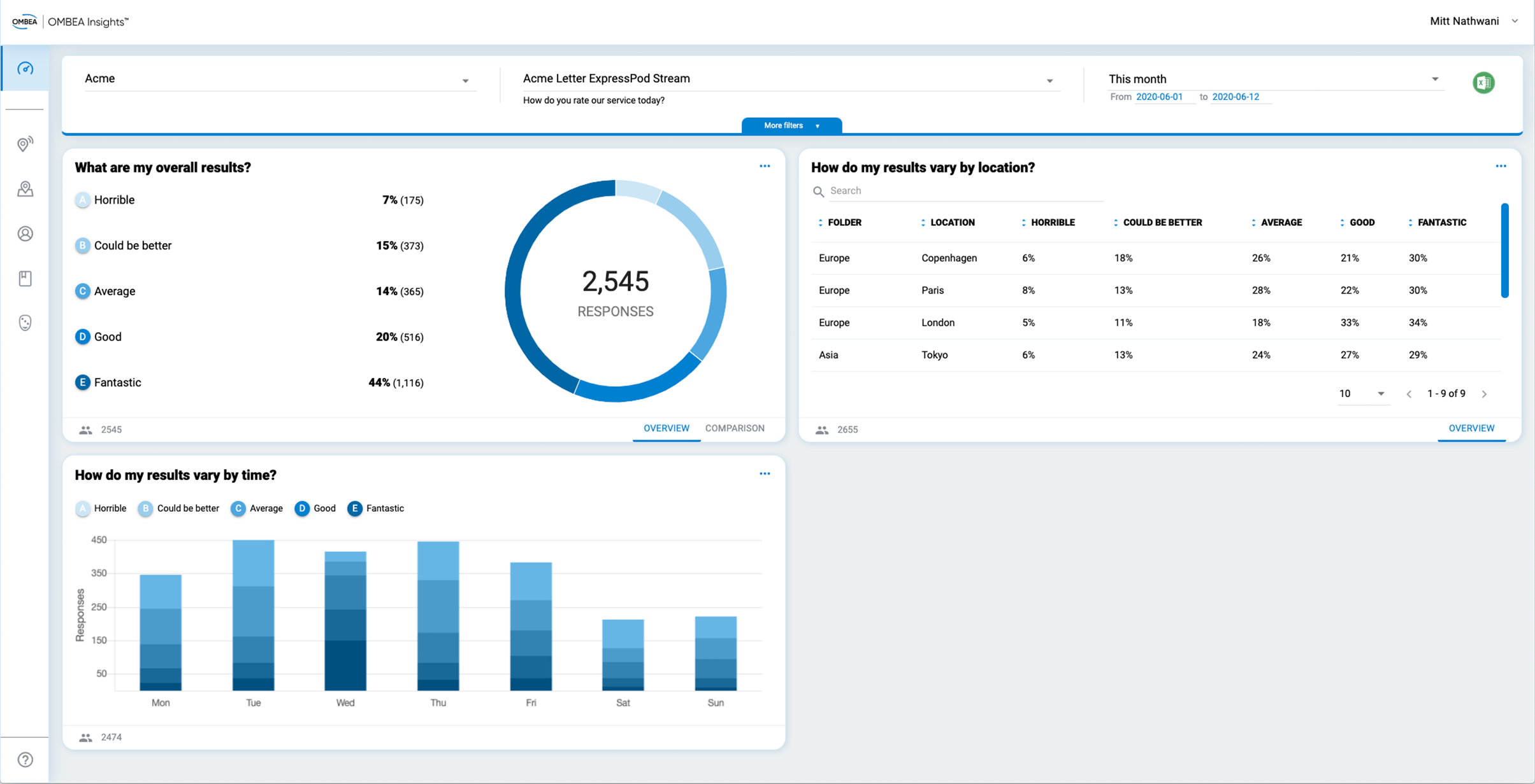
Consider using ExpressPods in Letter Stream mode to establish priorities for improvement.
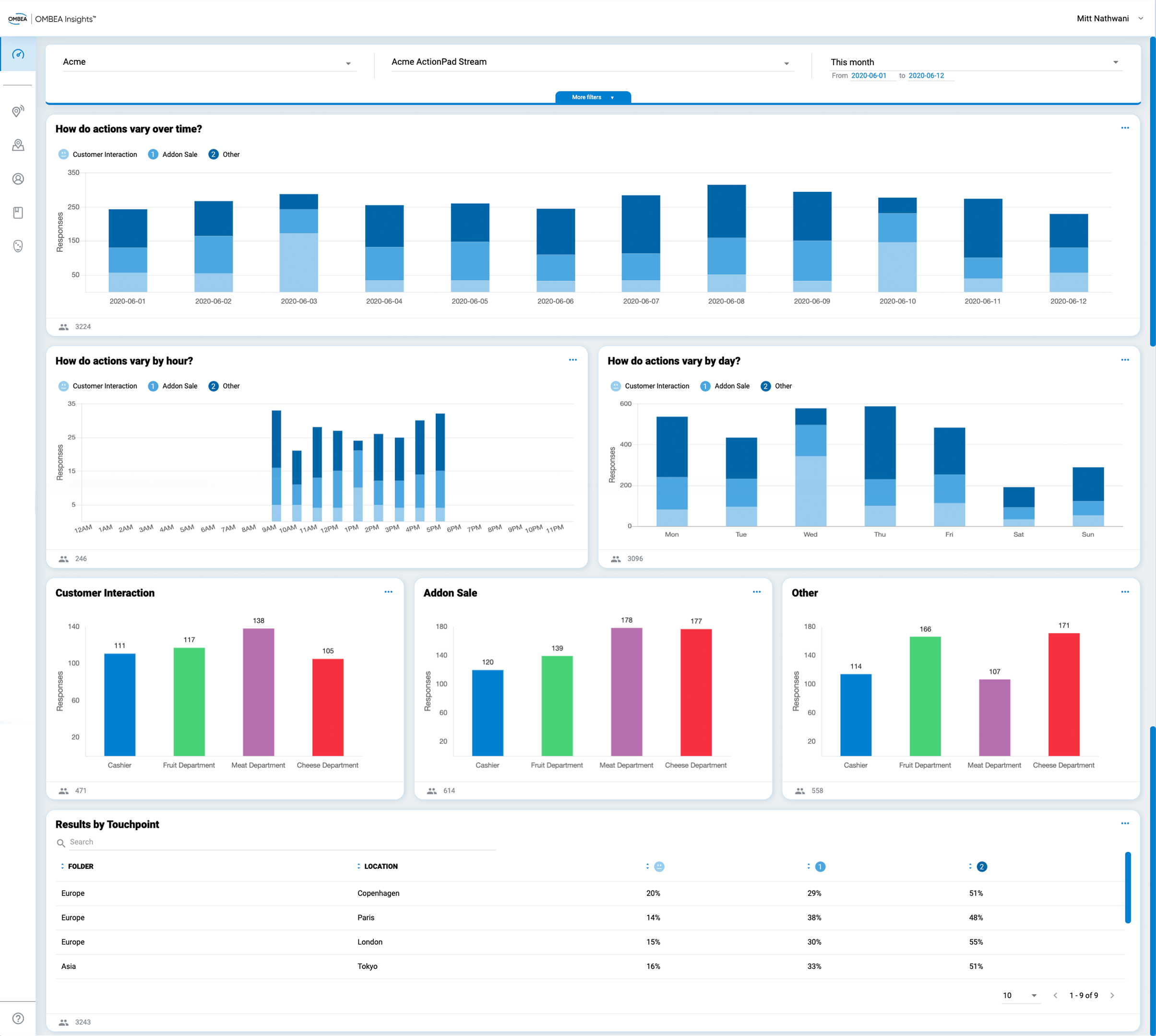
ActionPad Streams
This dashboard is for customers using ActionPads to track progress with staff behavior changes. The focus here is on reporting across different timescales, by team and by Touchpoint.
Link and Website Widget Streams
This dashboard is for any Link or Website Widget Streams. Each question in your Stream has its own panel.
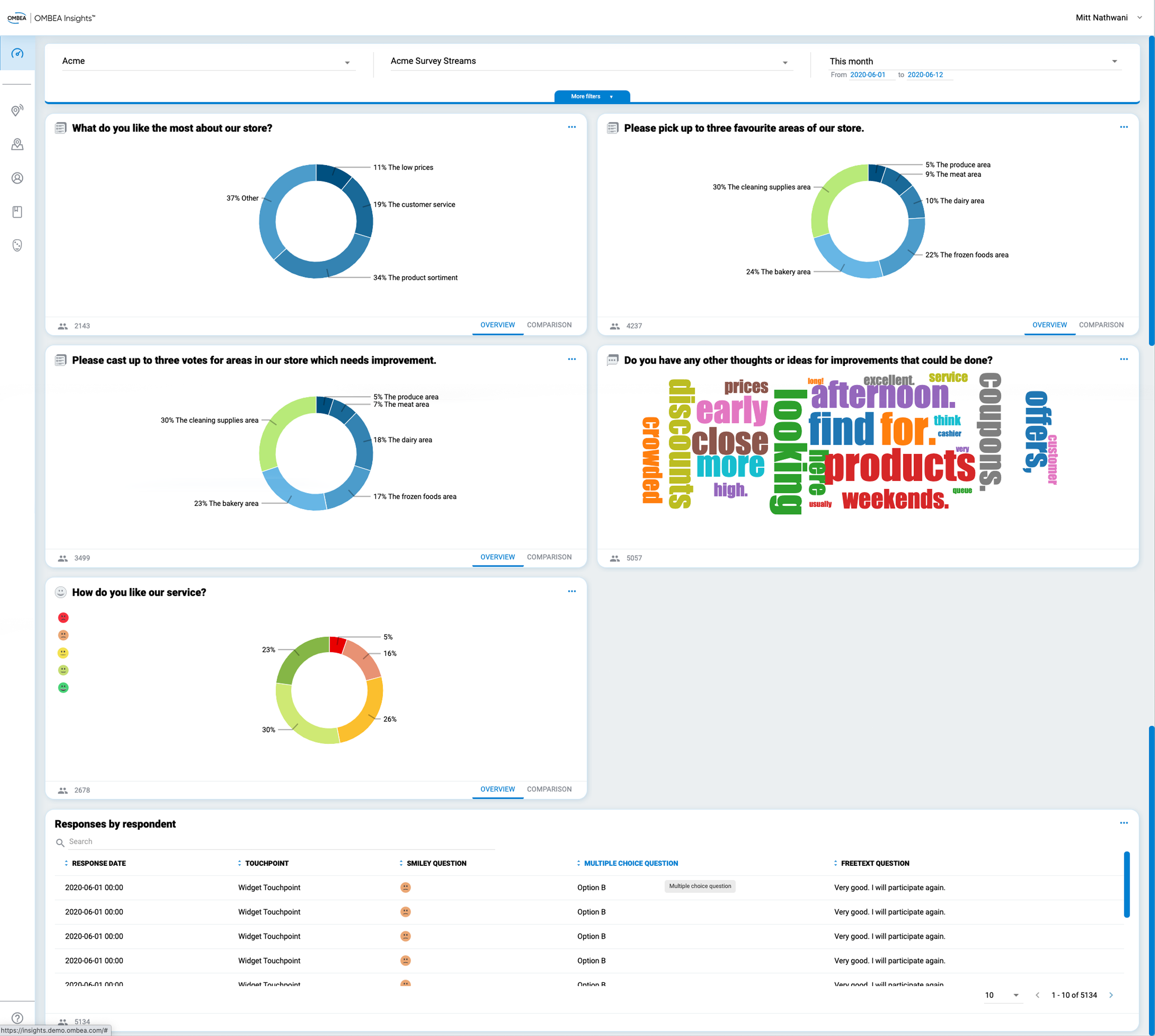
Click the Comparison button on any panel to view the results by time or Touchpoint. Click the three dots to the top right of any panel for more options.