From subtle improvements to major changes, here are some of the new features that you are getting with the latest Insights update.
New clean modern look
First, we’ve updated the look and feel of the dashboard with a new font and styles. The new look is much more pleasing to the eye and is also designed to make it easier and more efficient to navigate through the dashboard. New fonts draw the eye to the data that matters most, and new button styles and colours highlight the next step a user should take to advance their workflow.
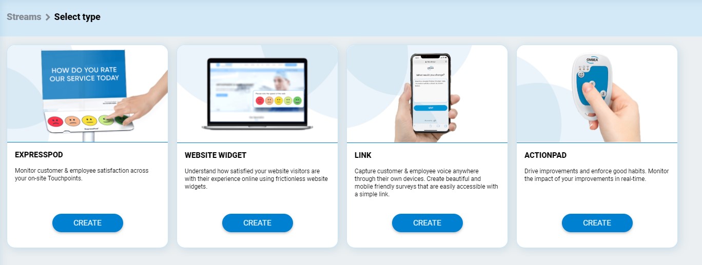
Redesigned Streams Menu
For those who haven’t read through our Guidebook yet, think of a Stream as a survey on steroids: A Stream defines the one or more questions, when and how they are posed, and from which Touchpoints.
You can choose between the following types of Streams:
- ExpressPod
- Website Widget
- Link
- ActionPad
The new Streams menu now includes images of what Streams are like in real-life, making navigation a lot more intuitive.
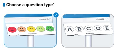
When a particular Stream is selected, different question types are also visually represented to make choices easier.
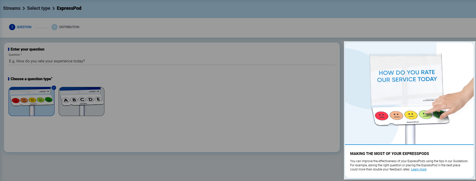
And if you want to learn more about a Stream, a new side menu will give you a brief to the point explanation of what it is together with a link to learn more about it.
Updated Dashboard Filtering
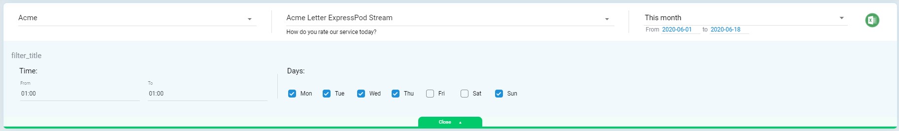
Finally, we have updated the dashboard filtering options. Now, whenever filters are selected, the filter menu bar will turn to green in order to draw attention to it. A nice little tweak which is very useful.

To learn more about using the Insights dashboard, read our Guidebook here.